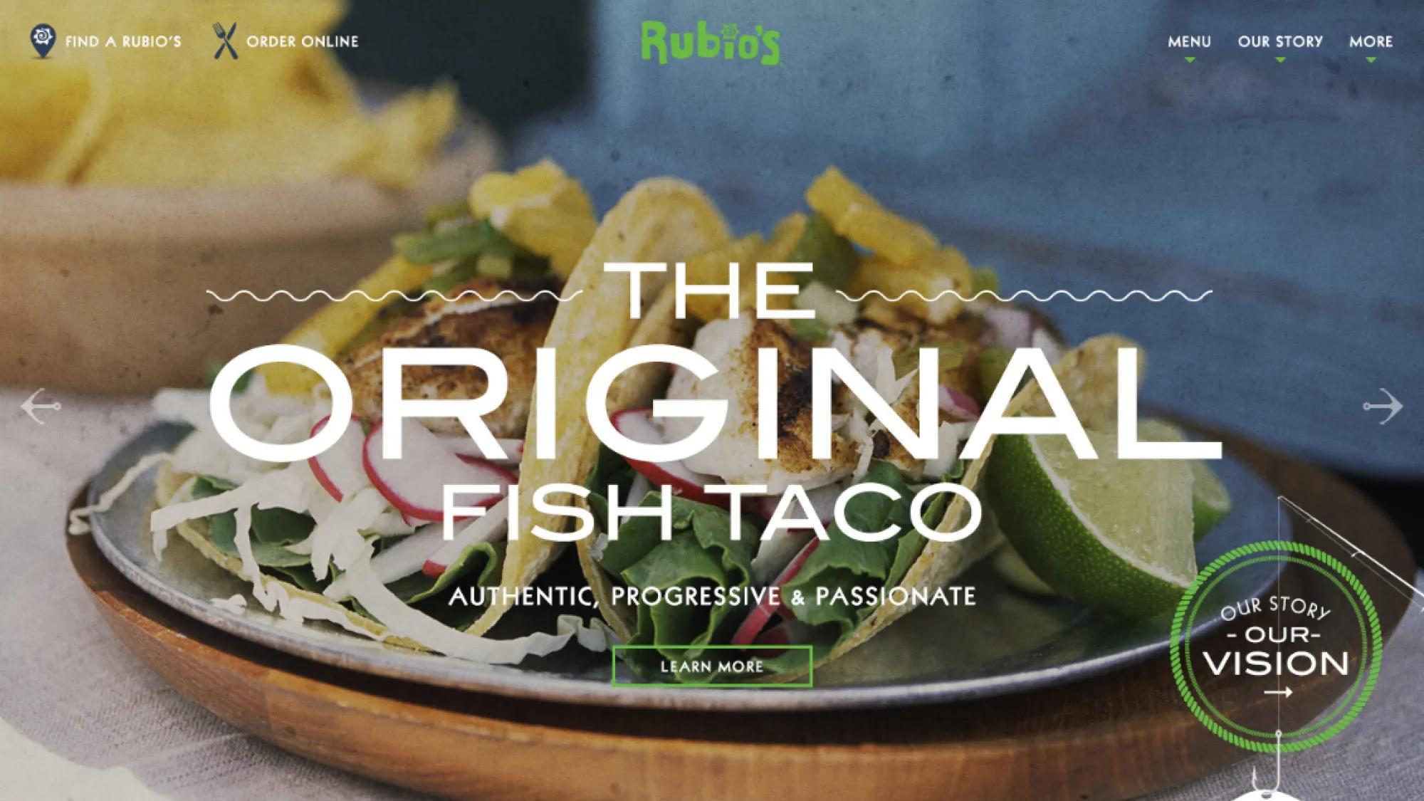
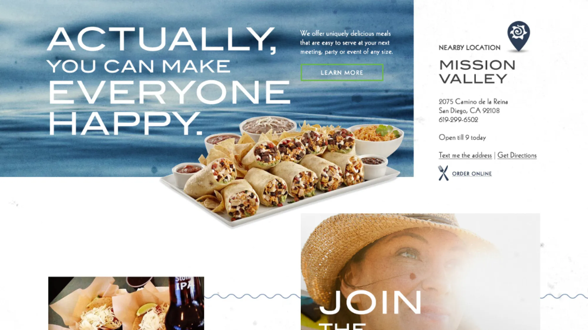
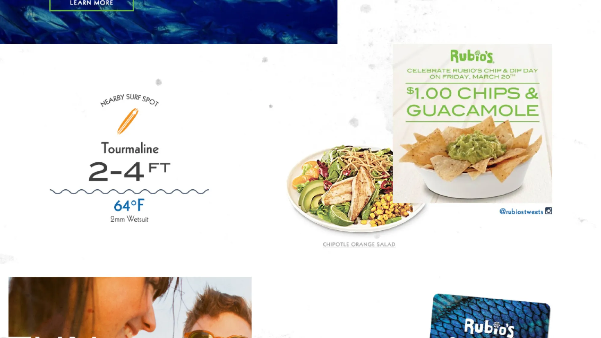
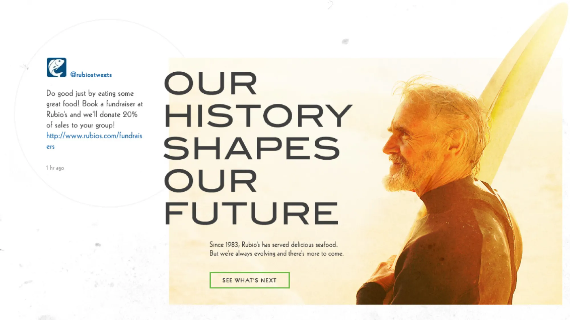
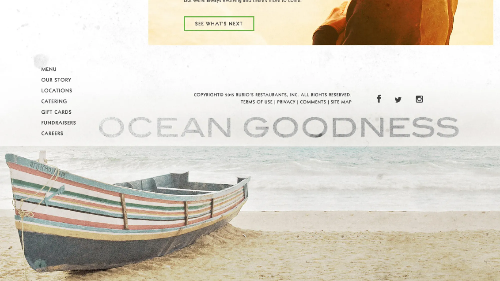
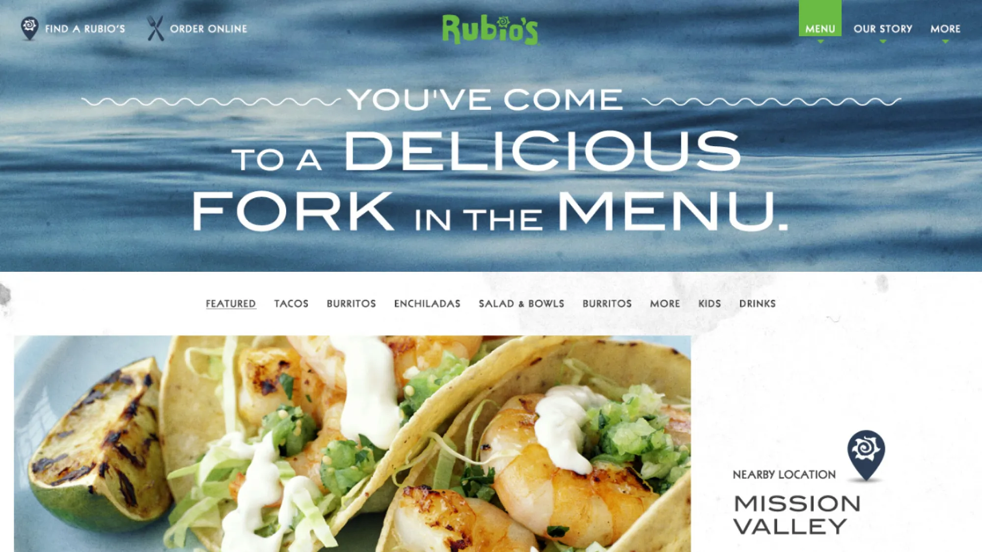
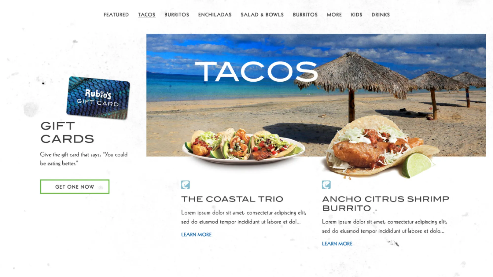
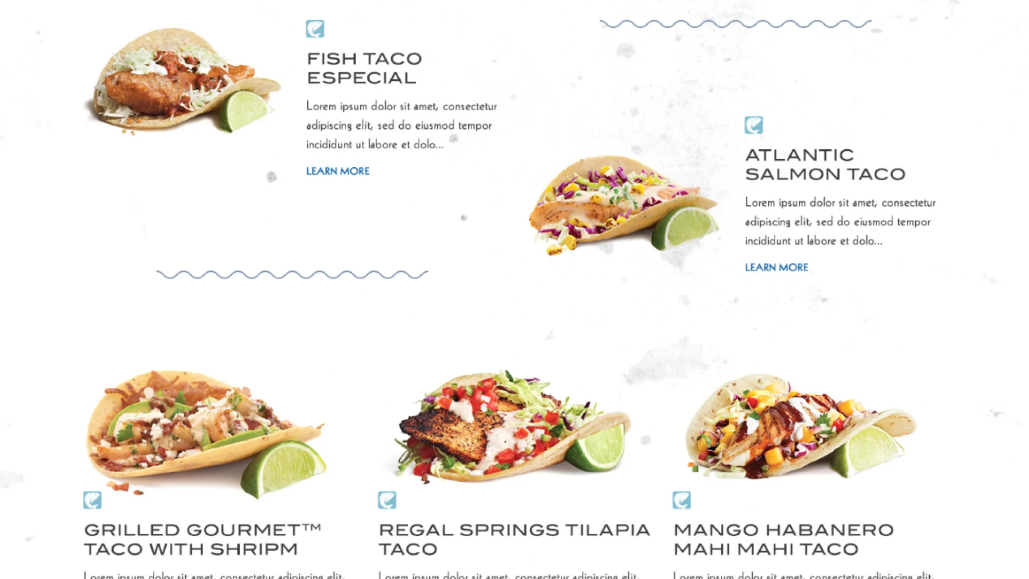
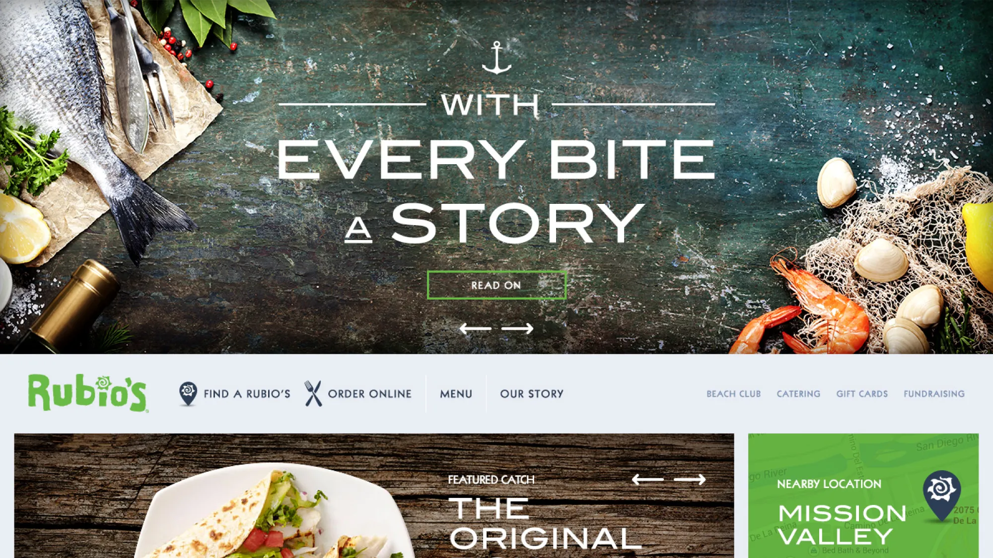
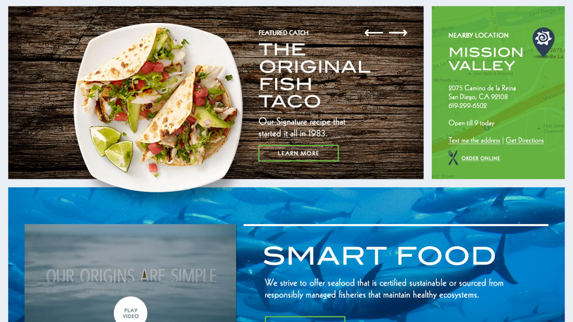
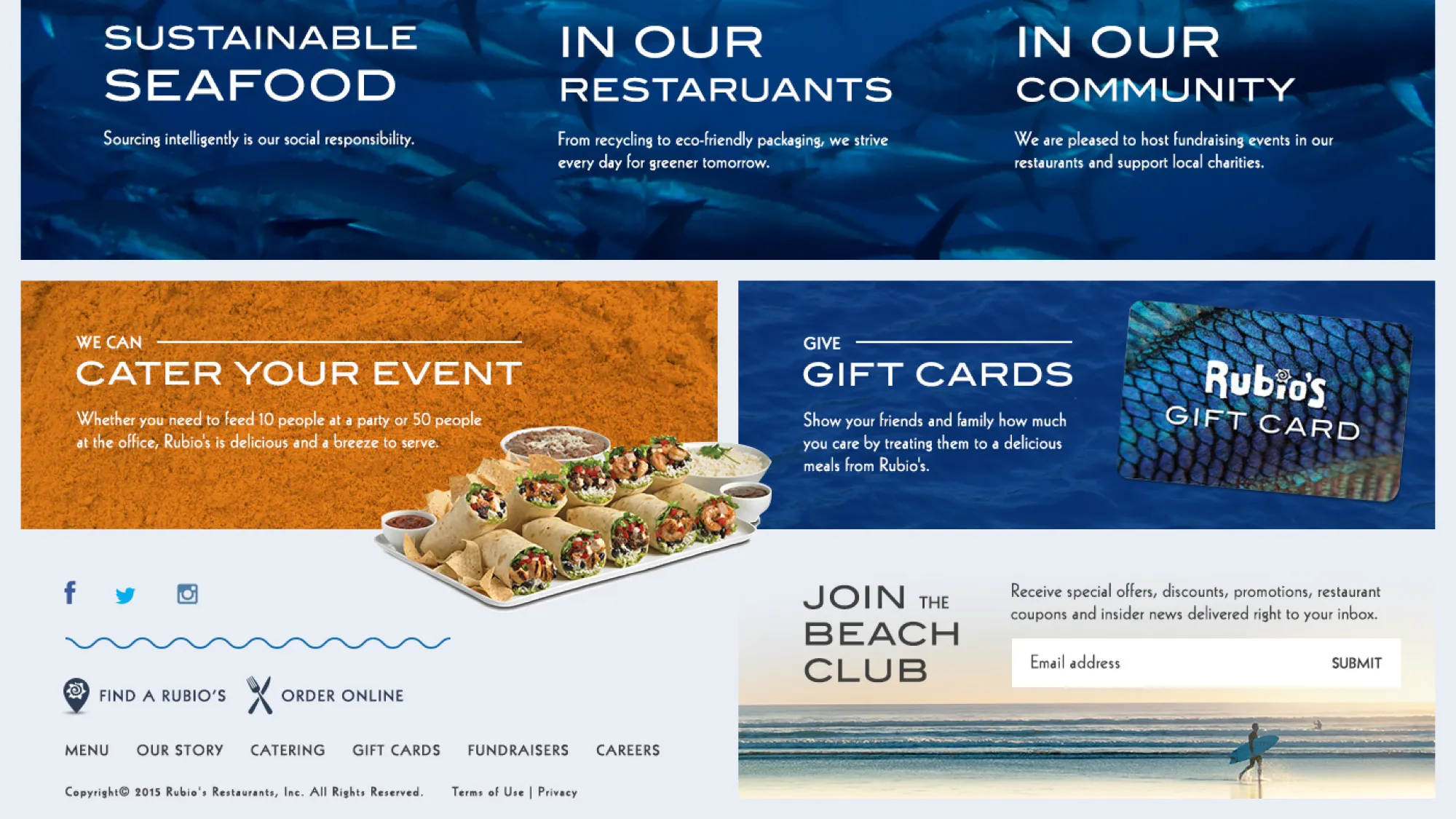
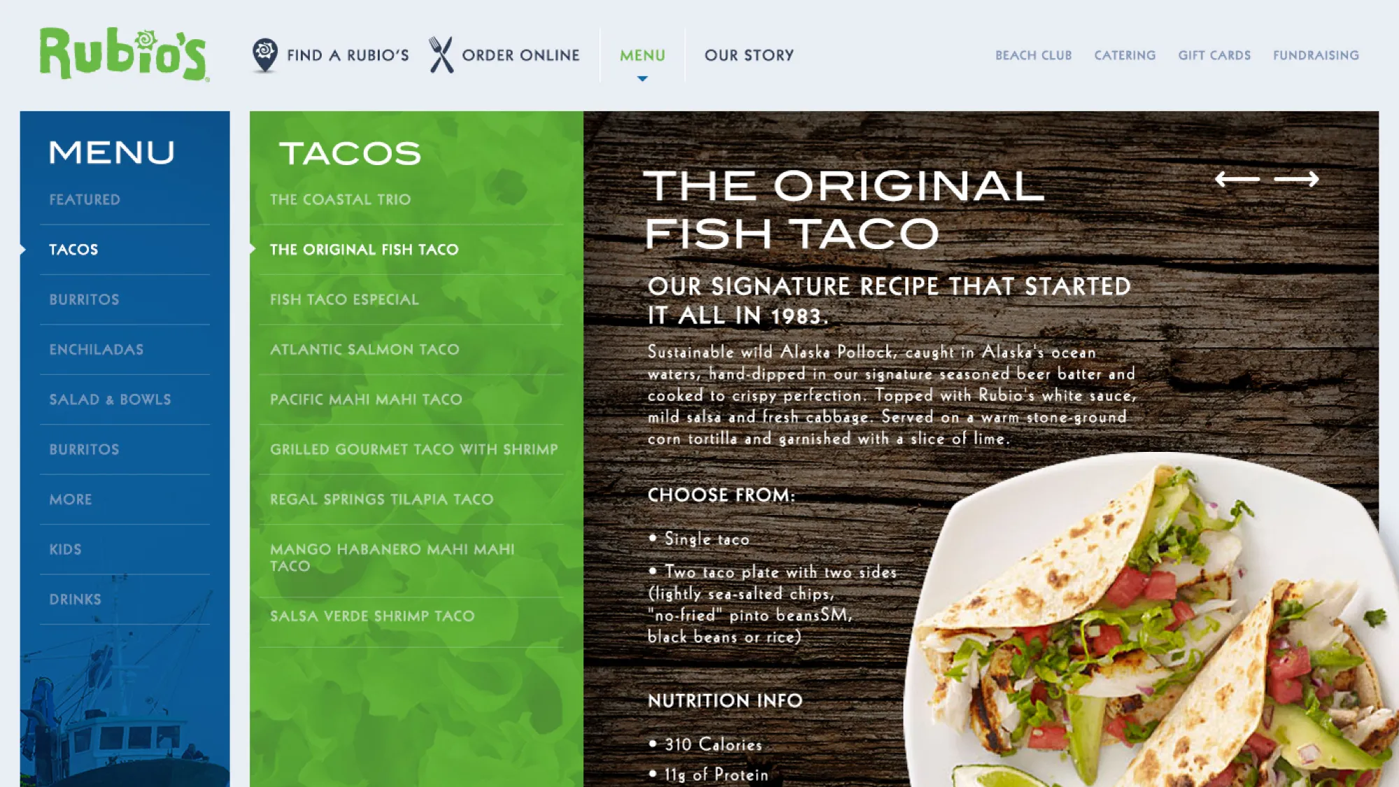
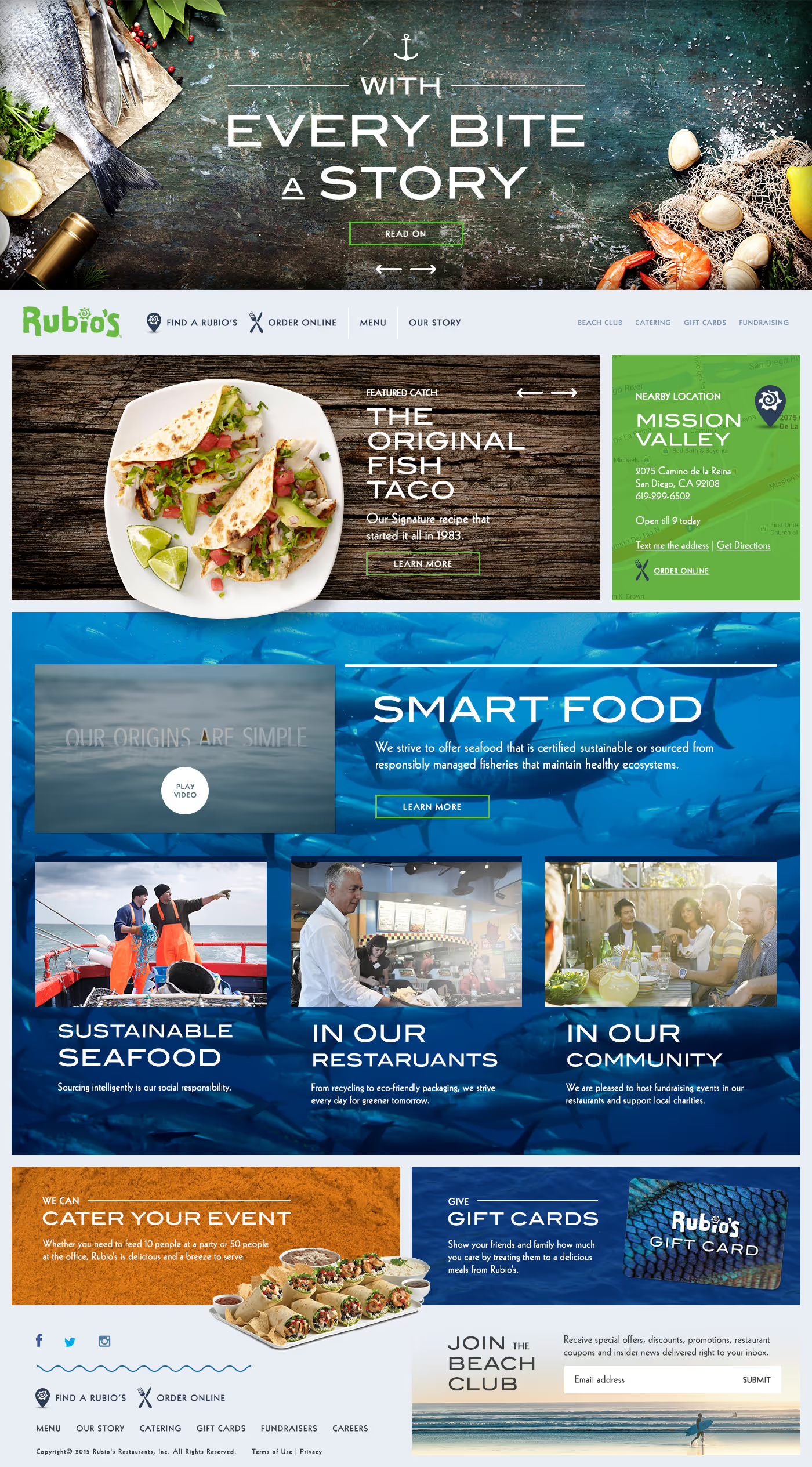
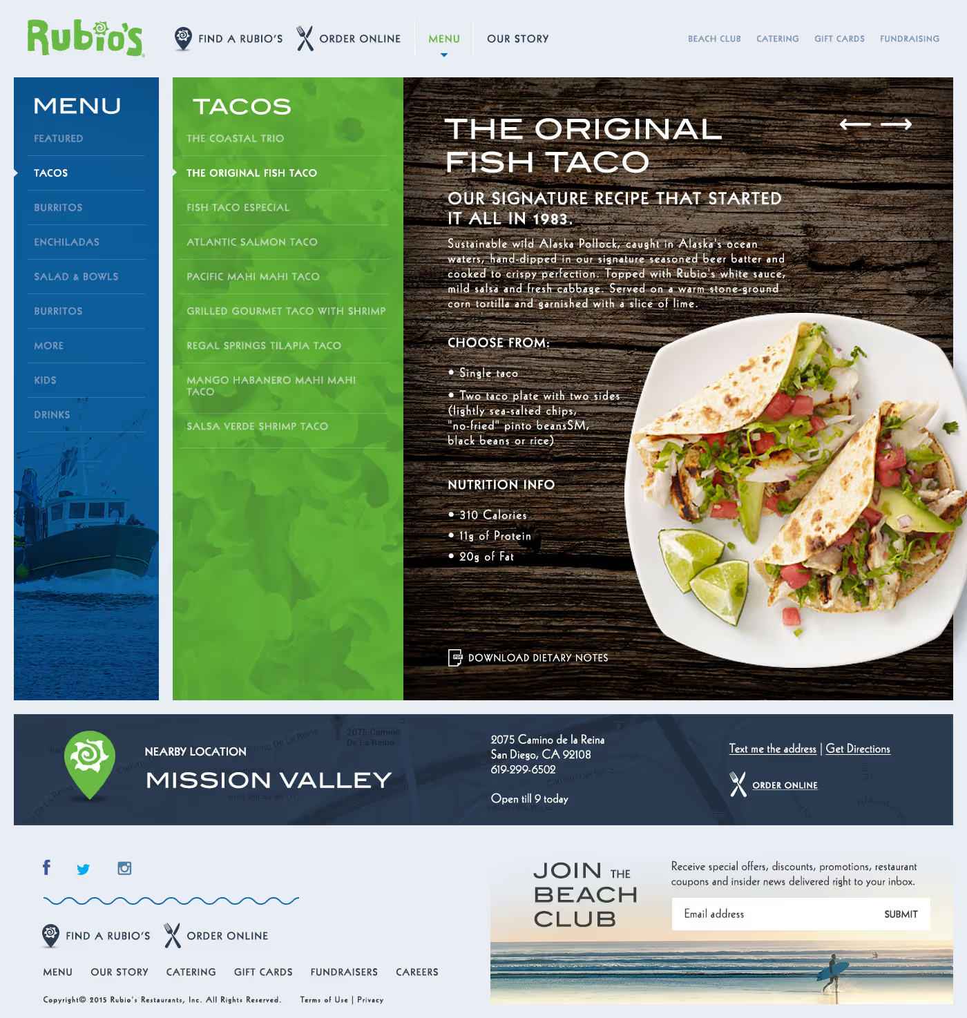
Second Concept
In contrast to the first concept, I wanted this design to feel cleaner and more symmetrical. A little more "corporate", but still have a little bit of style.
The client ultimately chose this design because, at the time, Rubio’s wanted a cleaner aesthetic.