Toyota partnered with Yahoo! to create a Hall of Fame for Fantasy Football players. There was a nomination and voting phase, as well as the reveal. I had such a fun time working on this site with a great team of copywriters, and the site was developed by Wildlife.
Challenge
How do you build on an already successful and fun website while making it easier to use?
Solution
I designed a fun and engaging modular site that made it more consistent on different screen resolutions.
Here's how i did it
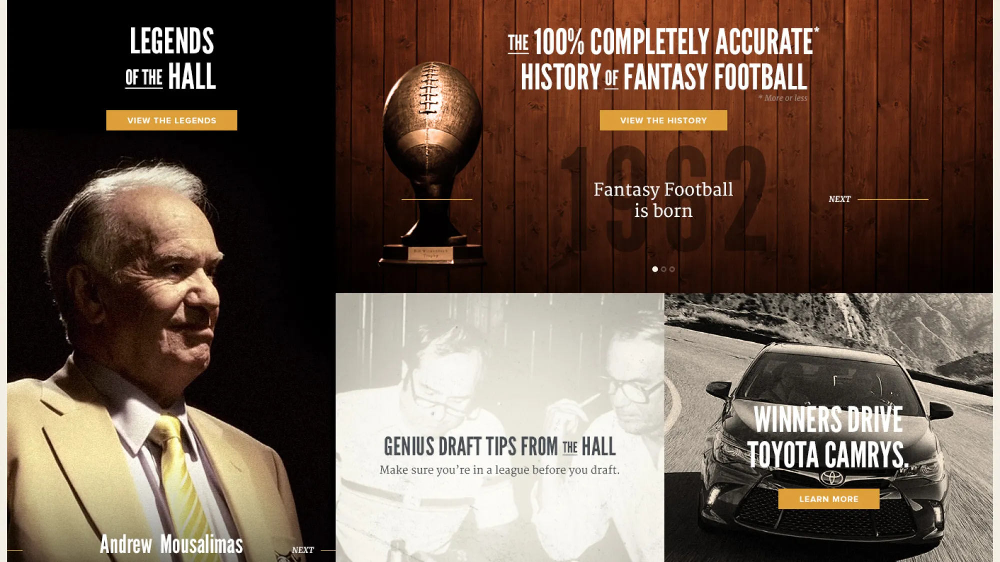
Early Explorations
These are some of the early design explorations that didn't make the cut.
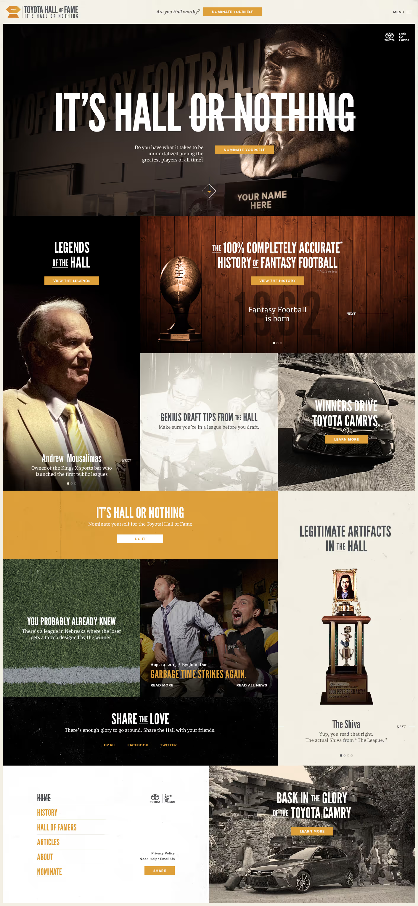
The Overall Design
Once the team got a look at the initial designs, we decided we needed a simpler, modular approach.
While trying to keep the overall layout simple, I still wanted to add some character and style to each element.
Mostly everything written on the site was tongue and cheek, and it was actually kind of fun helping out with some of the ideas.
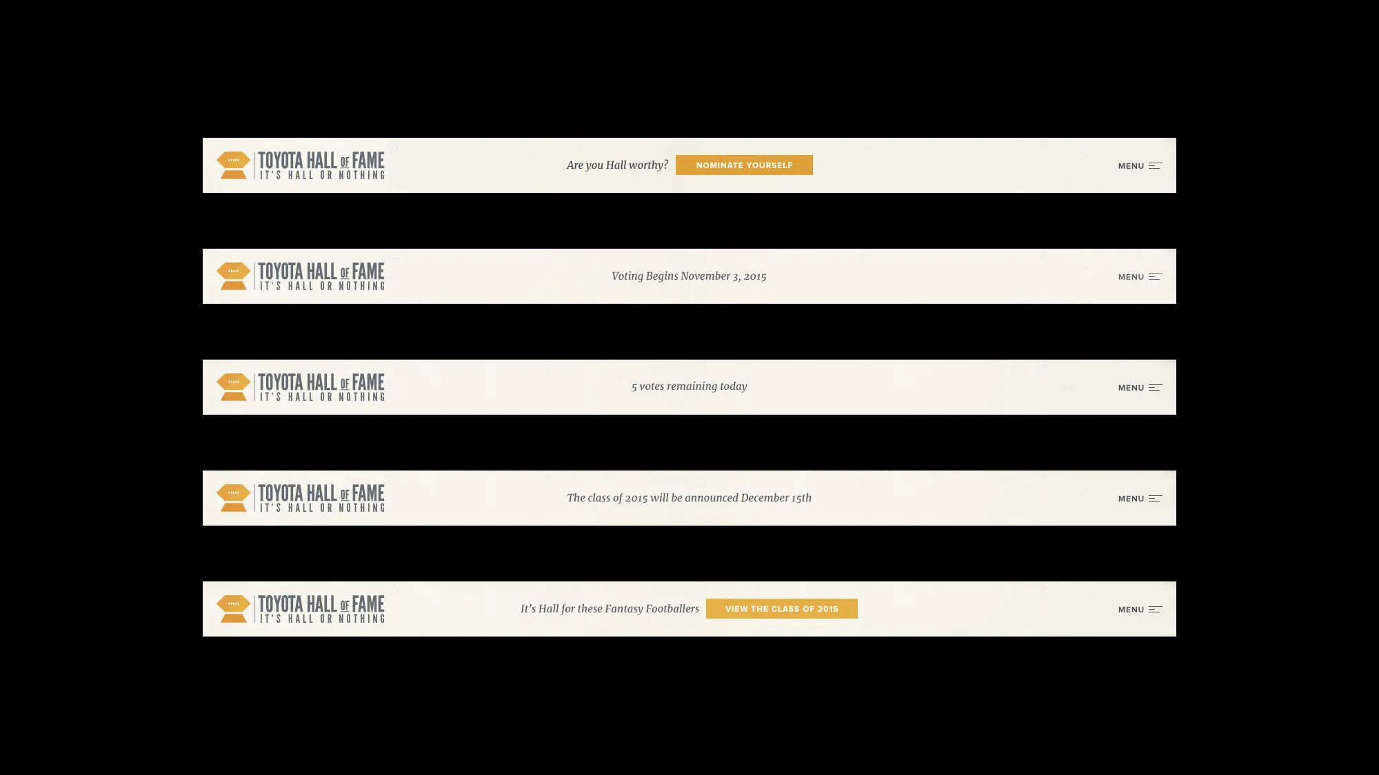
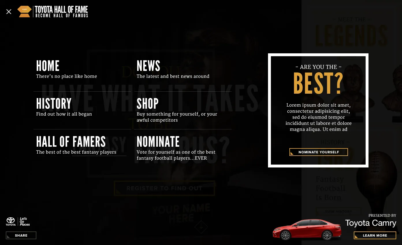
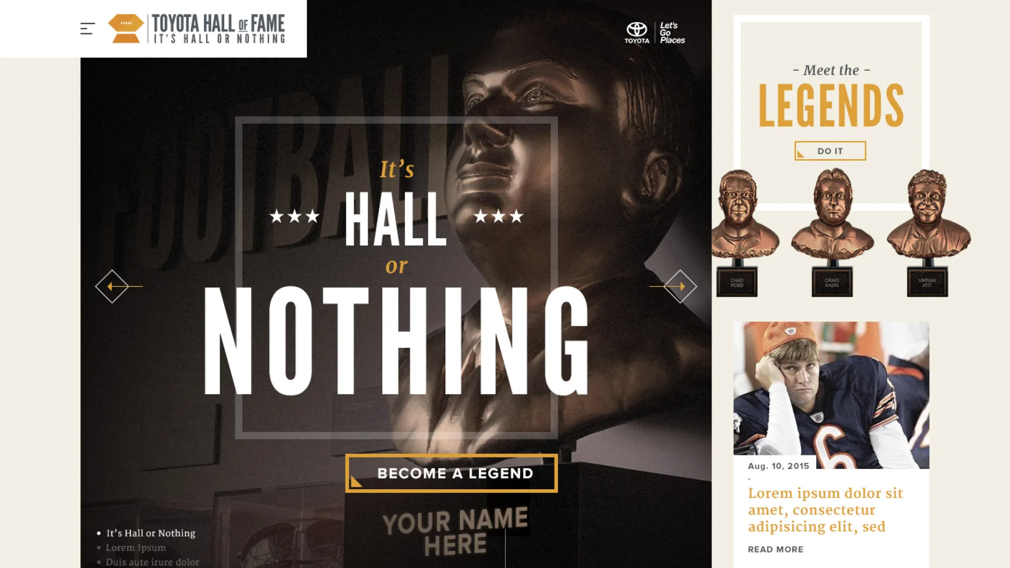
Main Nav focus
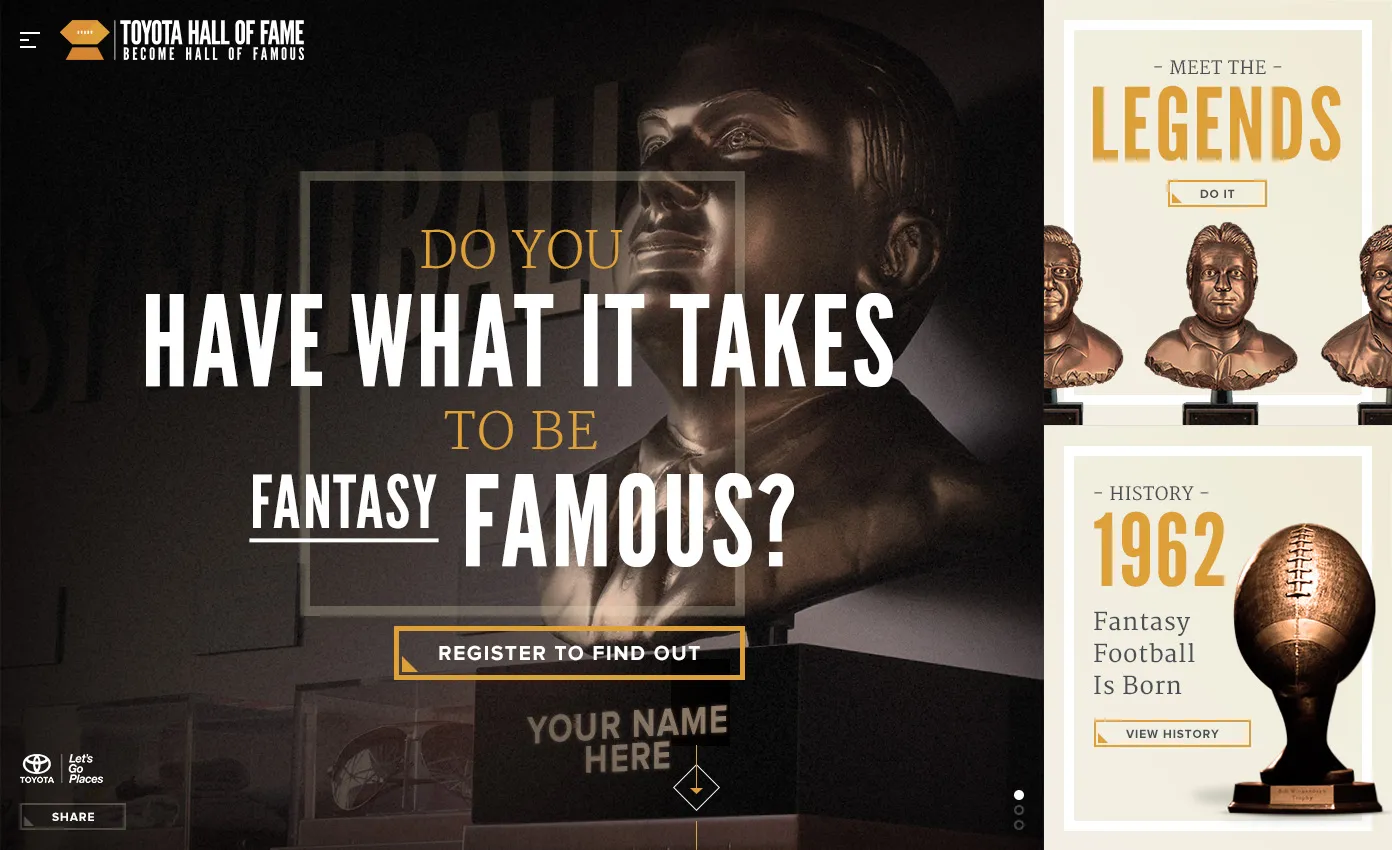
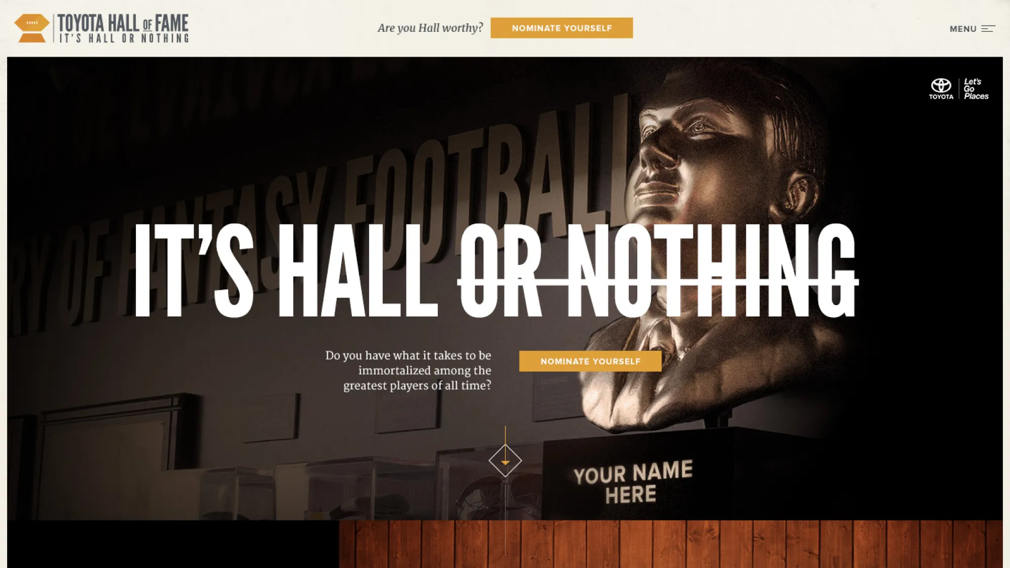
The goal of the site was to get users to nominate and vote on the next round of all of famers.
To do this, I wanted to focus the user on a main CTA or messaging for each phase, so I highlighted it in the main nav and used a hamburger for the overall site content.
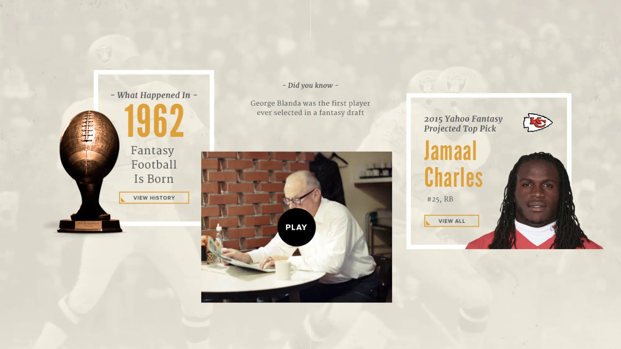
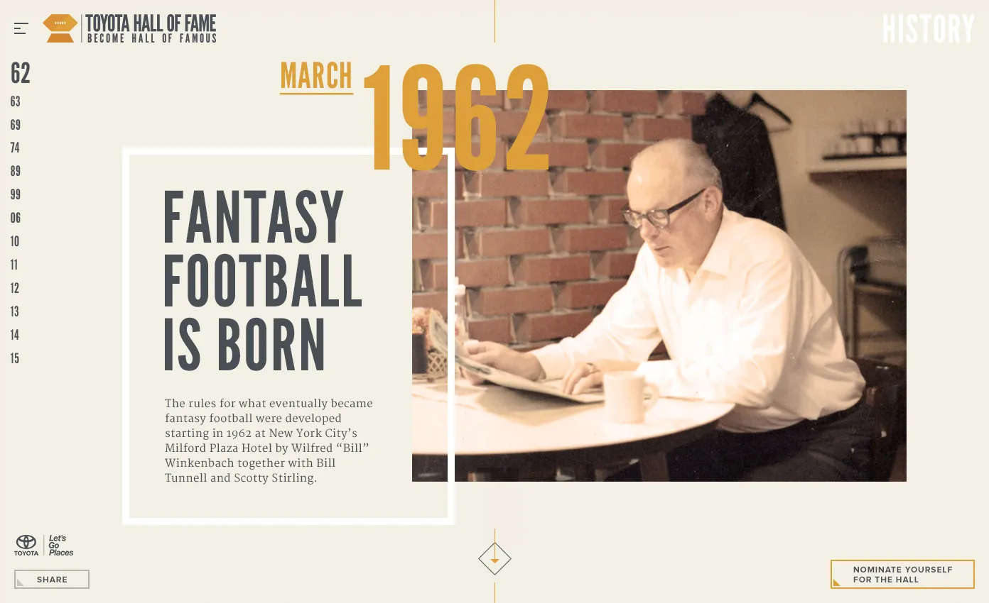
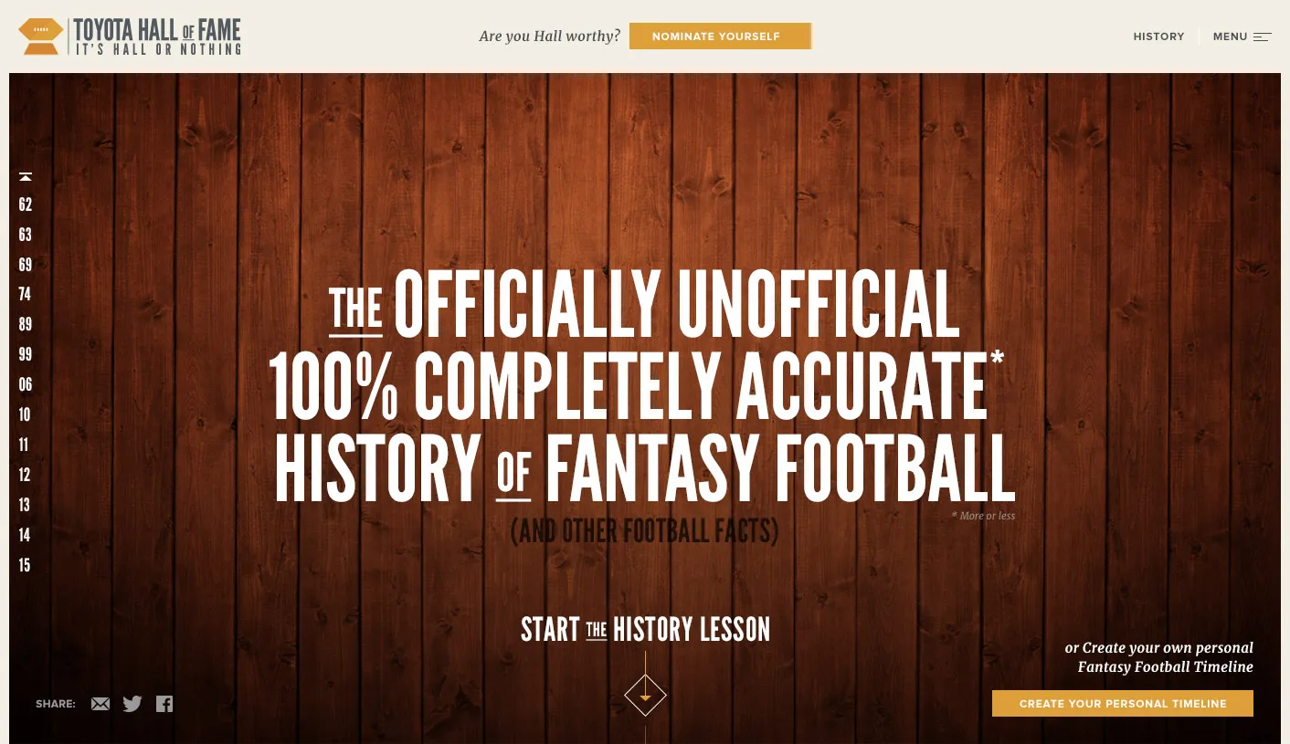
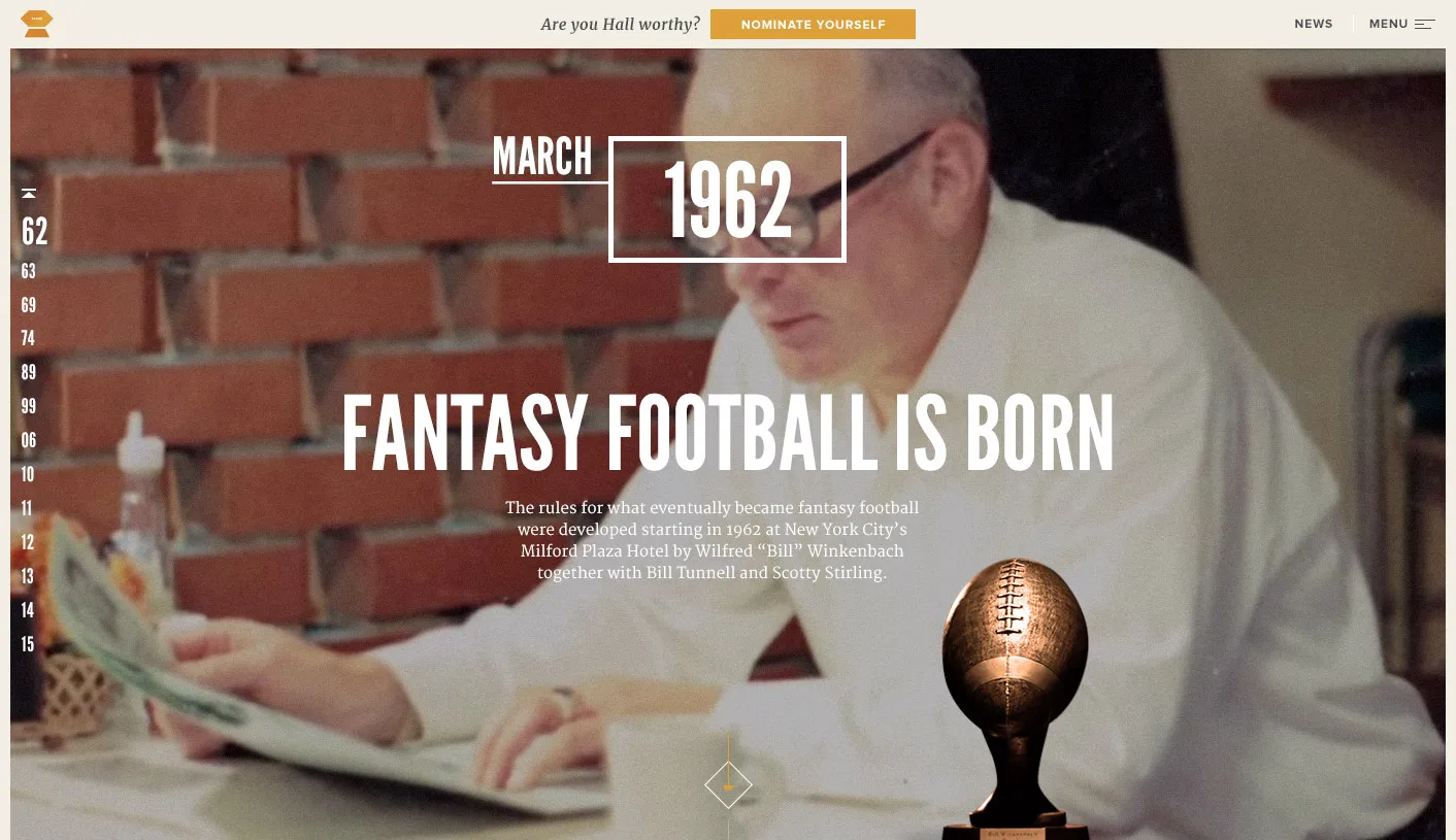
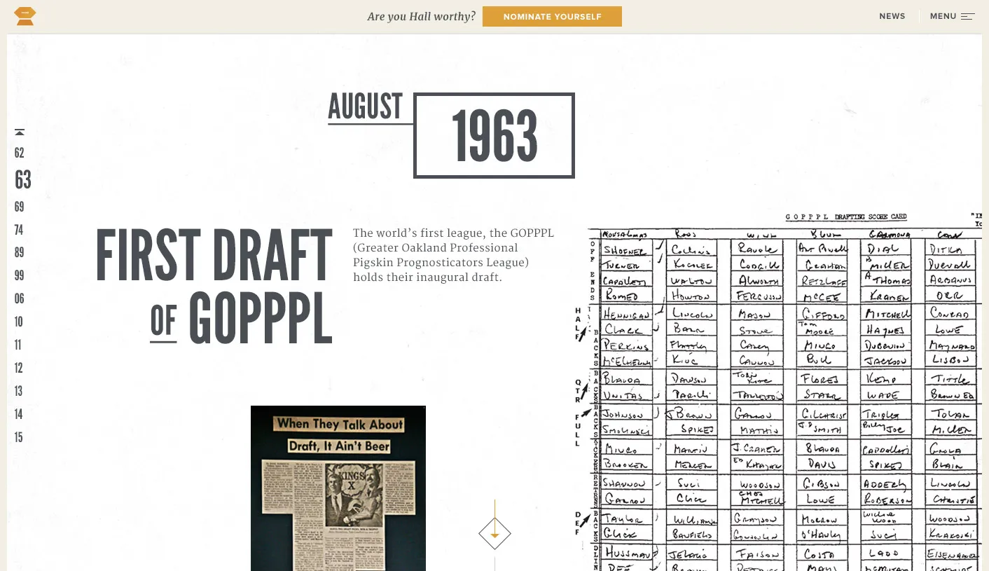
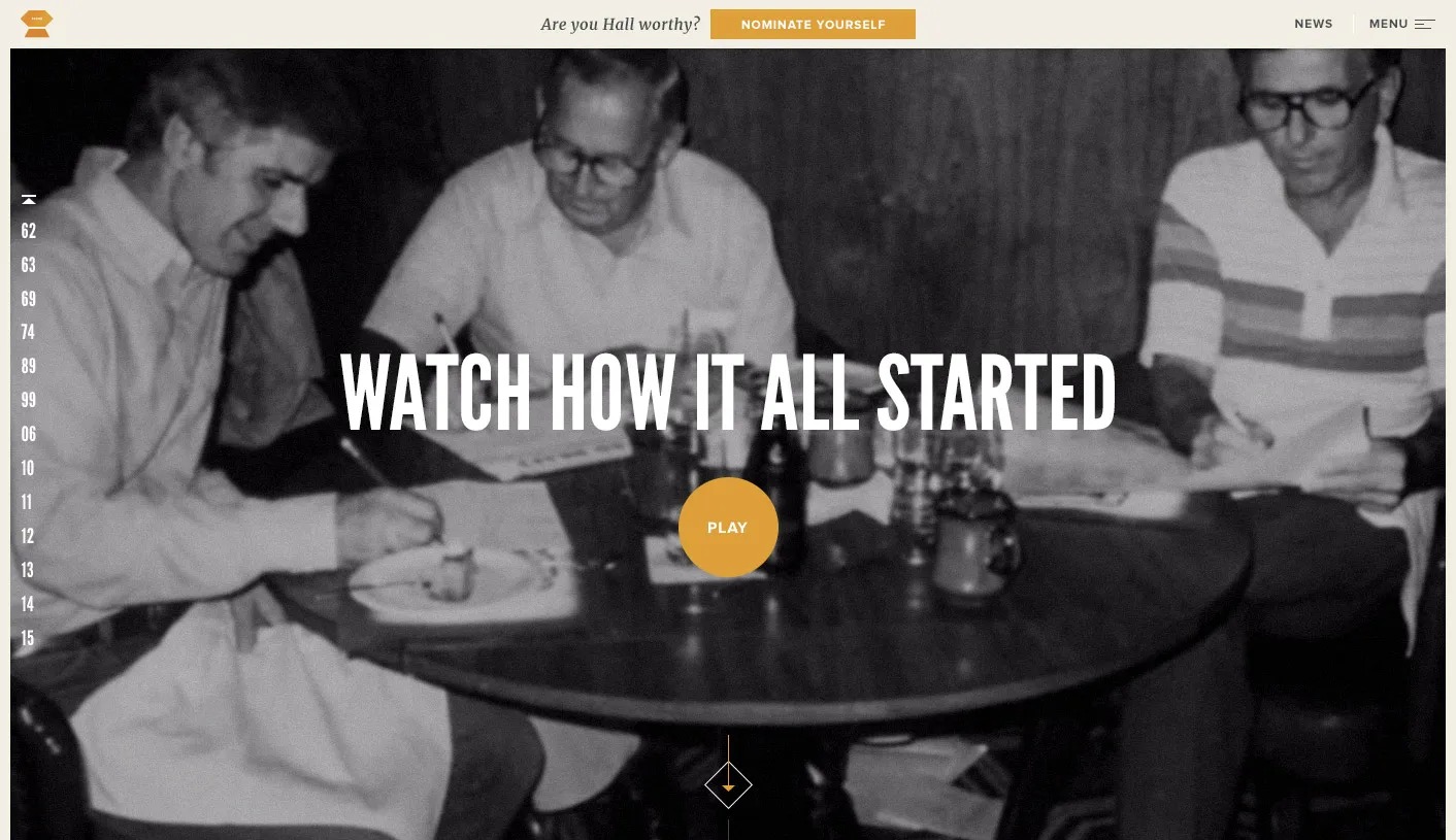
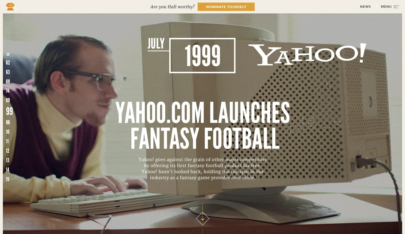
The History of Fantasy Football
The history section was where Icould play around with layouts and animations. I wanted to include a variety of fantasy football history, football stats, and videos, as well as highlight the new Hall of Famers.
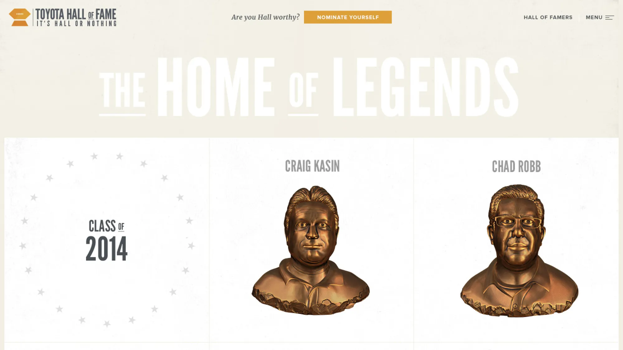
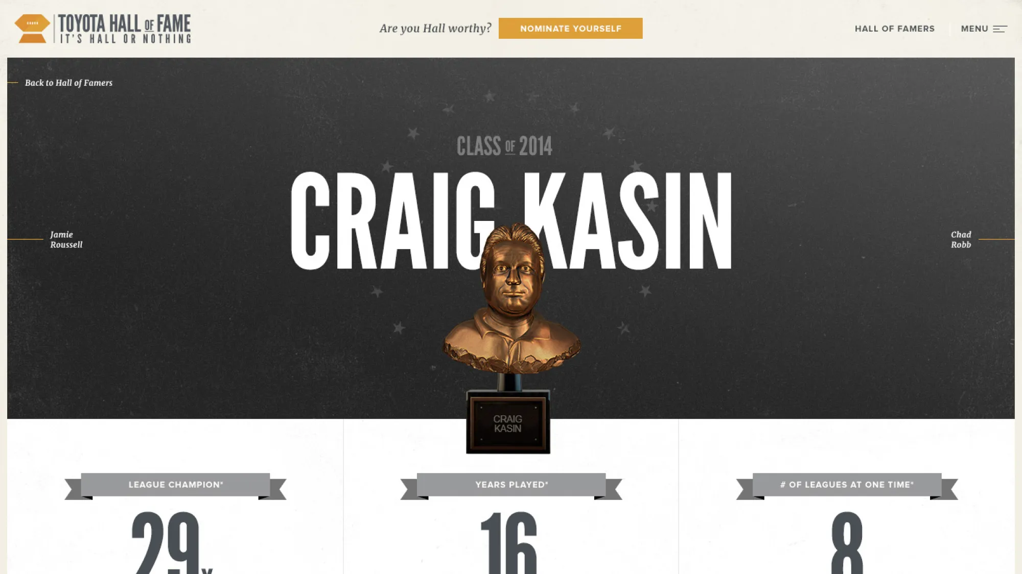
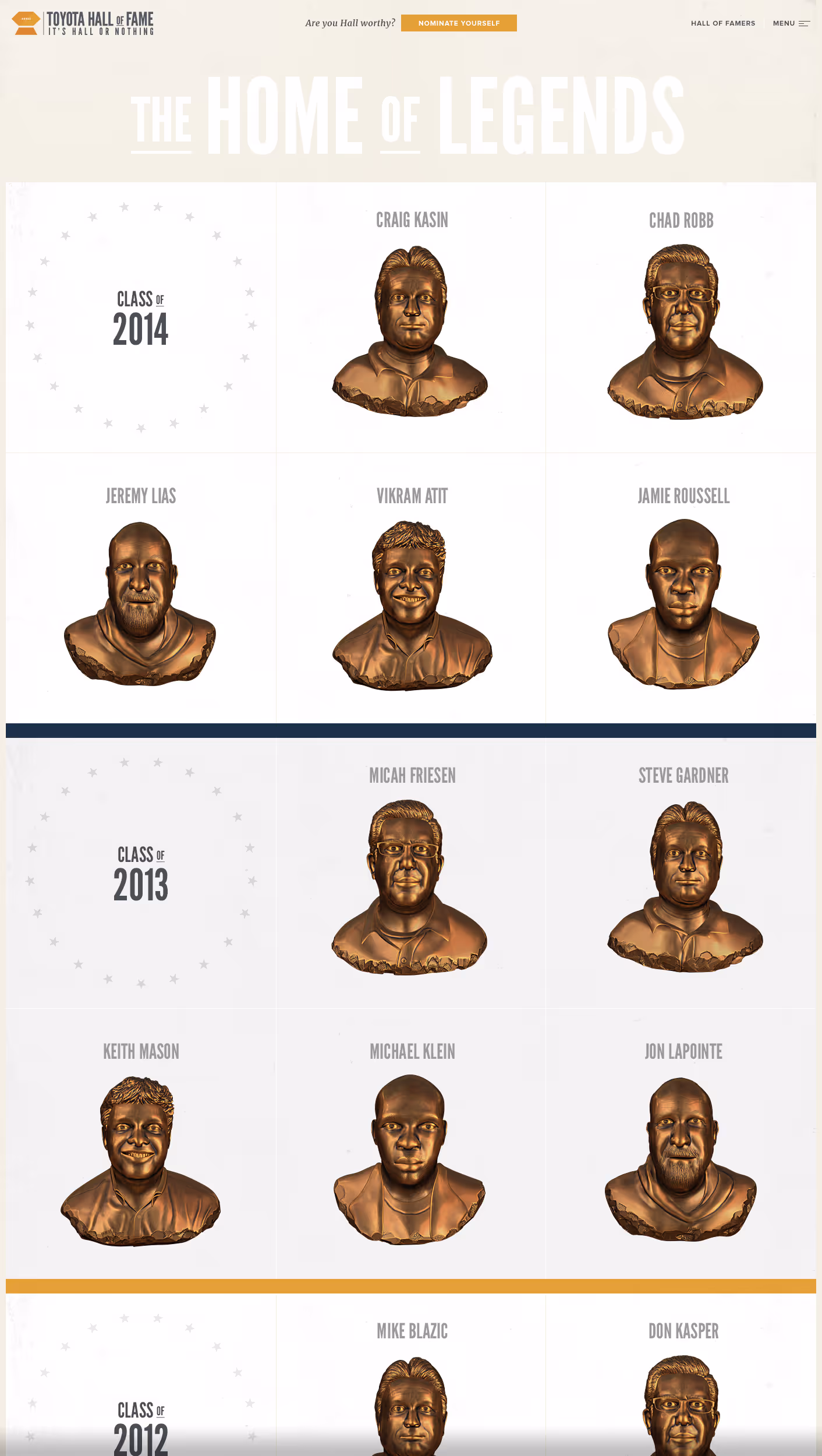
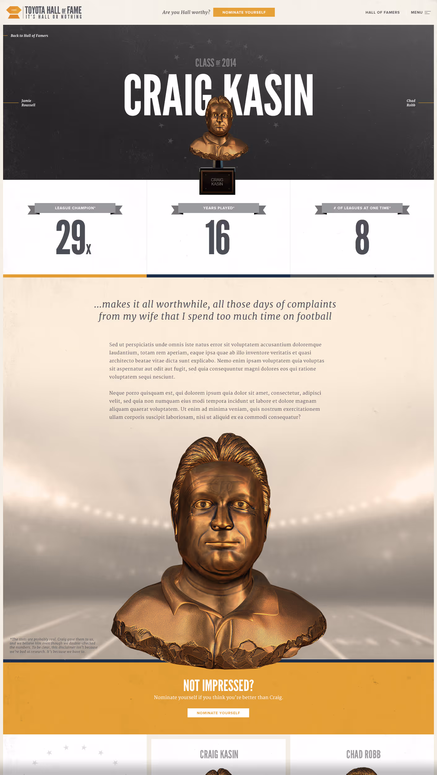
Hall of Famers
The previous site did not give the Hall of Famers the prominence the team felt they needed. A really cool asset we had for all HOFers, was a digital bronze bust that was similar to something you'd see in an actual Hall of Fame.